
This article is written by Marion Lean, Fibre Programs analyst, BDUK, DCMS.
In this period as we are all engulfed by media streaming, poring over abstract statistics or reading news articles, it is easy to feel information overload.
As we start to learn in detail about how our colleagues (now replaced by housemates) conduct their working days (in a dressing gown), it might feel like we are also being exposed to unnecessary insights. The way information is experienced can impact how it is interpreted, processed and applied. People are not all alike, identifying what is relevant, making sense of data and creating meaning involves different methods for different people.
A key agenda in my department is identifying how specific groups and geographical areas can be supported with access to broadband and developing programs to implement this. The landscape of telecoms infrastructure is vast, complex and dynamic. Typically, teams work in very specific contexts and are often siloed. It can be a challenge to connect up all the dots to understand how your work contributes to the bigger picture and to understand what you can offer a colleague in another team, not to mention finding meaning in large datasets of postcodes, for example.
Ethnography and data representation
In my role as data experience designer at Building Digital UK, I employ methods for data collection and representation that engage research citizens and stakeholders in meaningful and impactful ways.
- Want to write for us? Take a look at Apolitical’s guide for contributors
Ethnography as a research method involves observing and interacting with people in their own settings, for example, their home or workplace. In data collection, employing innovative approaches like ethnography is a way of keeping research subjects engaged and creating a sense of shared experience to develop trust. This provides an opportunity to collect more “on the ground” insights and invites people to explain their situations in their own words to create a deeper understanding. Using ethnography, qualitative research insights (those that are descriptive rather than numerical) can be applied to shed light on quantitative datasets, for example statistics. The UK’s policy lab uses the term ”thick data” to describe the information that is gleaned from zooming into lived experiences, as opposed to big data that can present a more high-level picture.
Data representation refers to the way information is presented, for example, using infographics or colour to symbolise particular aspects or using film to illustrate a particular finding. By sharing information in novel data experiences and displays, the aim is to bring to life both the achievements and challenges of the department. By engaging with this information experience, my public servant colleagues are invited to consider the broader impacts of their work and its effects by reframing it, to motivate the development of new ideas.
We use ethnography to get insights and observations that would be missed in a survey
In other words, we use ethnography to get insights and observations that would be missed in a survey, and we use data representations, like visualisations or film, to hold a mirror to these communities, get a different view, and include them in ways a policy report wouldn’t be able to.
Displaying research data in meaningful ways moves beyond the “standard” data visualisations — graphs and bar charts — to engage its viewers emotionally. One great example is RSA Animate, where documentation from public talks and events are represented through animation. In a time of information overload where even data visualisations (and memes) become repetitive and numbing, it is important to present data that connects with its viewers, leaves lasting impressions and motivates meaningful response.
Mapping broadband use
Together with colleagues in the UK Fibre Programmes analysis team , we recently completed a research study that employed novel methods to gather real-world insights to examine impacts of the uptake of faster broadband connections.
Faster broadband isn’t just great for streaming Netflix — it drives economic growth by boosting productivity. It also makes the public sector more efficient by, for example, making utilising telehealth services and other online services that can improve wellbeing possible. Our challenge was to engage real people, gather information and present insights to stakeholders for use in program and policy development.
To help in our overall aim of building an evidence base for fibre broadband, what was not meaningful was a list of websites that people use or how long people spend on Facebook per day. Instead, we wanted to develop an understanding of how connectivity supports daily activities in both lifestyle and work. Or, in what way does having access to broadband allow you to fulfil your daily personal and professional needs, and longer-term goals?
To answer this question, we spent time within various communities to learn who they are and the types of activities that take place in their work and home lives. To engage research participants and to capture the process and record their insights, illustrator and dialectographer Mitch Miller joined me in capturing the responses we got from people across the UK. Mitch is known for his large-scale dialectograms — hand-drawn, fine-detailed map-like drawings of a community or place.
Seeing the world in a new light
By physically being in our participants’ offices, village halls and living rooms, we were able to get a sense of the types of relevant individual community activities and needs. From here, deeper observations and insights provided an understanding of how broadband supports lifestyles, including wellbeing and business productivity. The findings of this research form an evidence base for benefits of fibre broadband that includes use cases, case studies of high and low impacts, and personal feelings and emotional responses about broadband connectivity.
This is captured in a large-scale, hand-drawn map of the research landscape portraying stakeholder relationships, geographical areas and individual anecdotes and insights. These are shown in the main middle section of the “map”. This information is useful for stakeholders developing new programs and understanding patterns in existing schemes. Imagery from the dialectogram has been used to illustrate BDUK projects in both internal and external events, for example in a presentation at the Connected Britain conference in 2019 and the Social Research Association conference gallery, also in 2019. The dialectogram is now displayed on the wall at the Building Digital UK London office.
Due to its scale (A1 paper) and novel appearance, the dialectogram attracts those nearby to have a closer look. Viewers can look at the types of people their work is impacting, read the anecdotes and see how their work in broadband infrastructure is supporting many communities in different dynamic, tangible and overlapping ways.
(The article continues after the illustrations.)
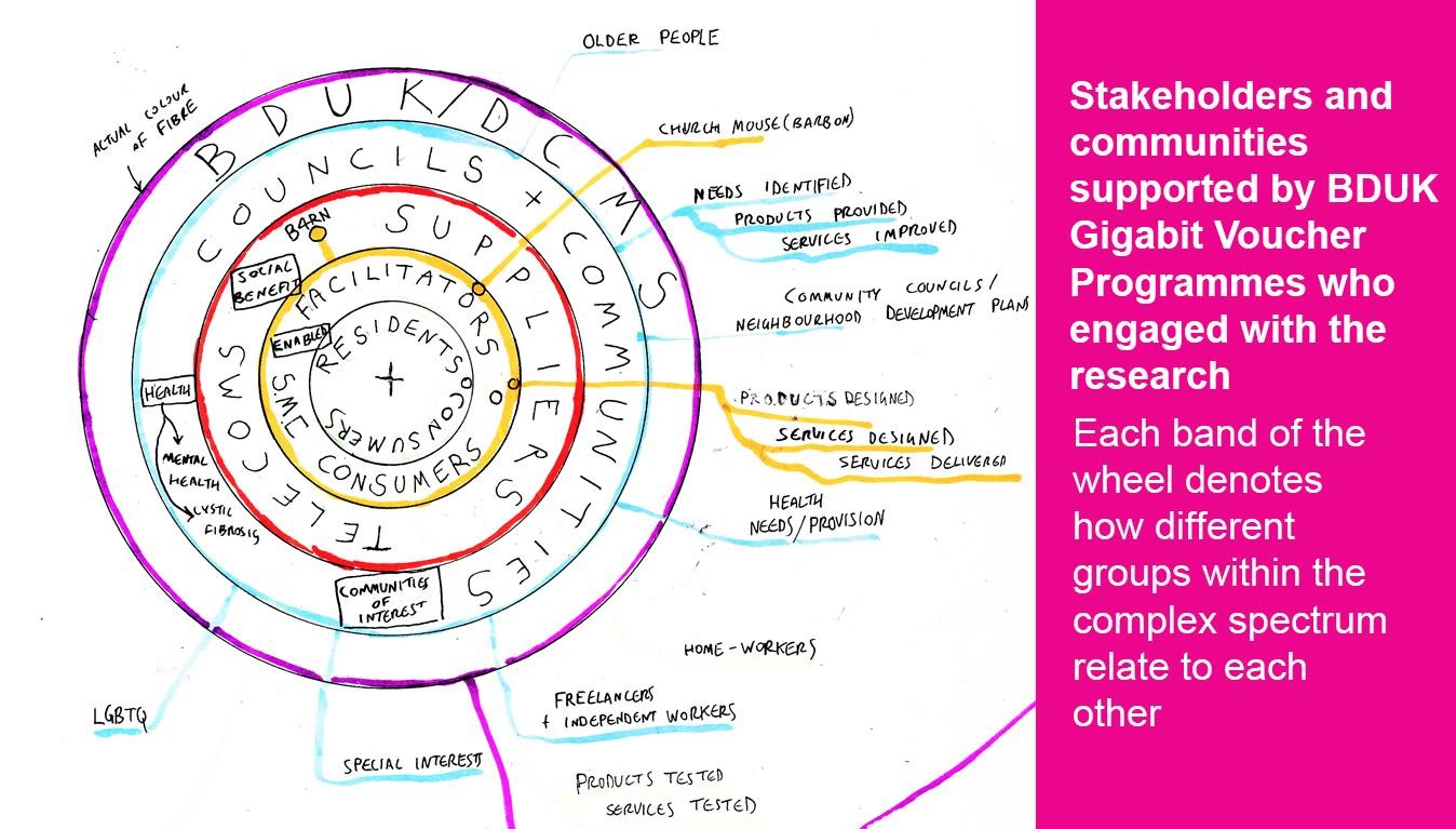
A detail from the hand-drawn map of the research. This wheel shows different stakeholders who provide and benefit from fibre connections.
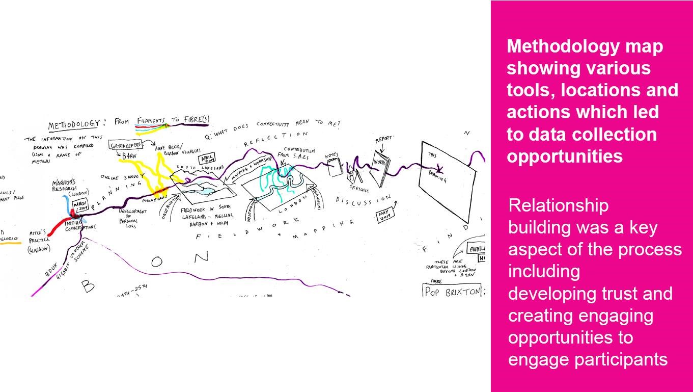
This drawing, found along the top of the hand-drawn map, is a depiction of the methods and activities that were used. This includes relation-building (for example, using phone calls) and visiting potential sites of interest and places in which ethnographic research took place. The processes of interviewing, note-taking and finally developing into “this drawing” are shown.
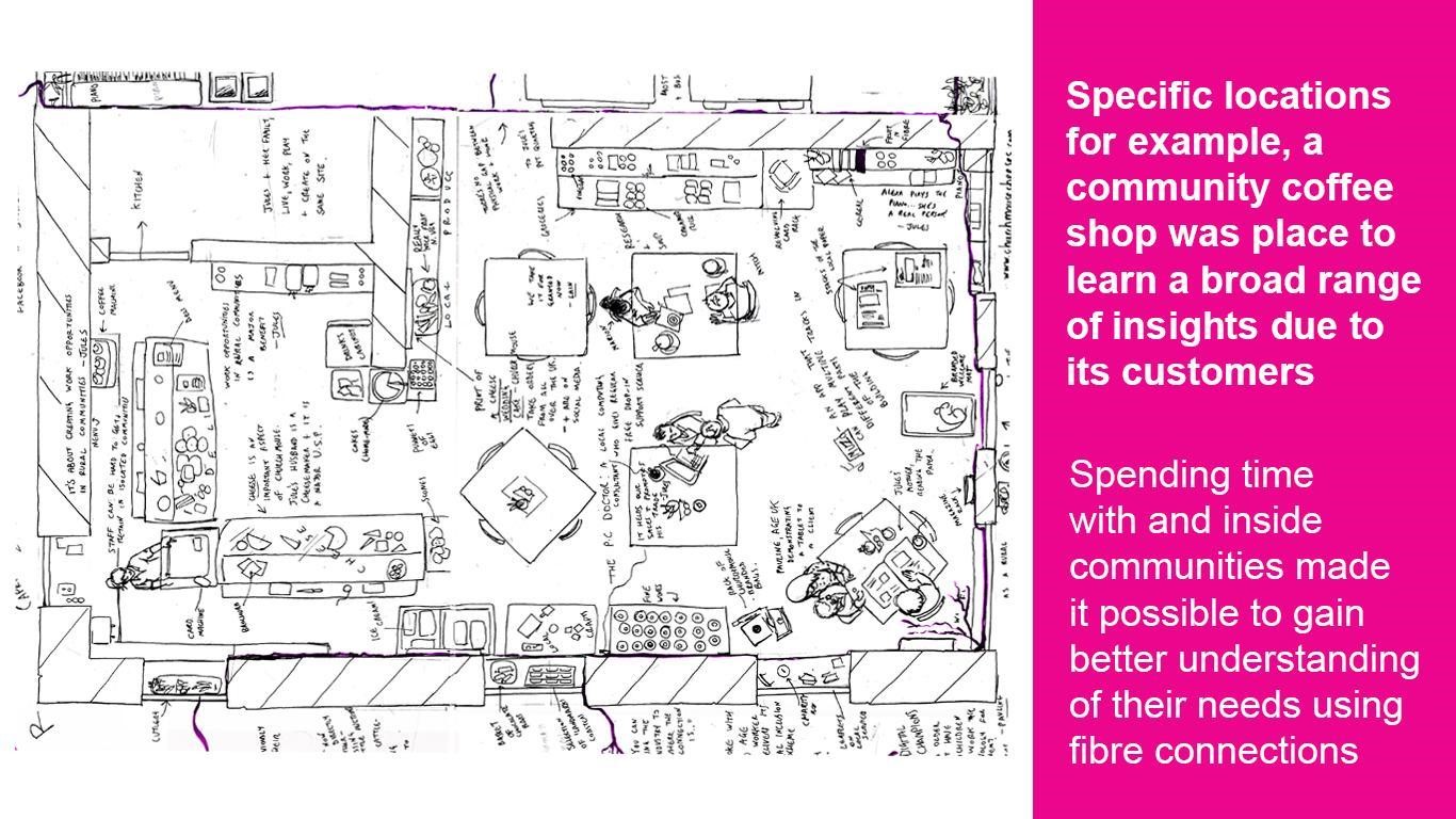 This part of the drawing features one of the locations where the research took place. This is a small coffee shop in a small rural village. The drawing shows the layout of the venue but also anecdotes about the types of people who live there and their use of fibre connections.
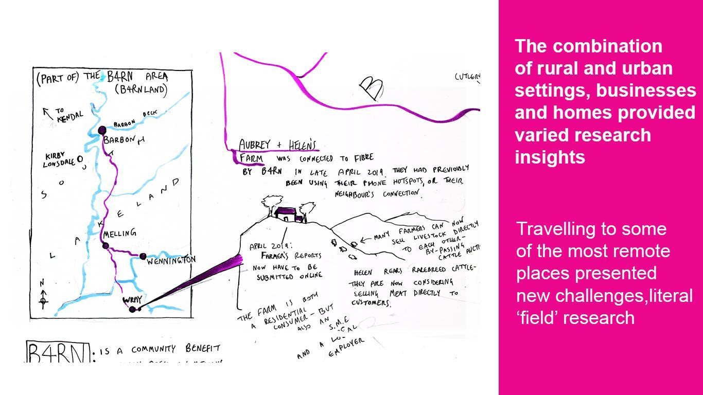 This drawing shows the geographical location of research settings. On the left is a “zoomed-out” map of the area, on the right shows a rural farm on a hill previously never connected and was now enabled through the help of a community broadband connection. Having a connection affords the farmers new perspectives in terms of commercial possibilities, for example selling meat.
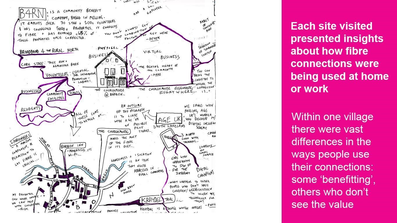 This drawing shows some of the sites visited and names some of the stakeholders who shared insights that informed the study. For example, the charity Age UK told us about their “Tablet loan scheme”, where older people are given a 3-month loan of a digital device to try out and learn about the internet.
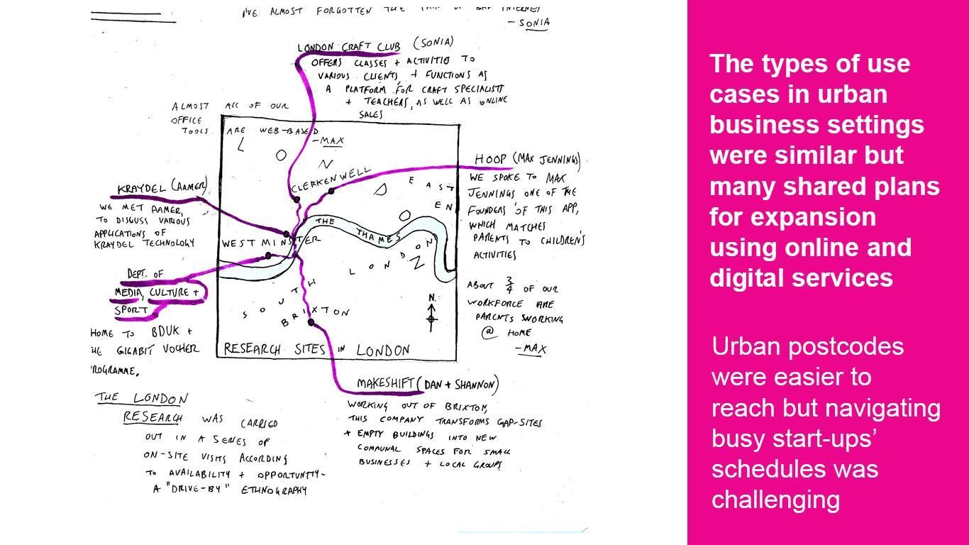
This drawing depicts businesses that were visited in the urban location. The map and the anecdotes are used to briefly identify with whom and where the research took place.
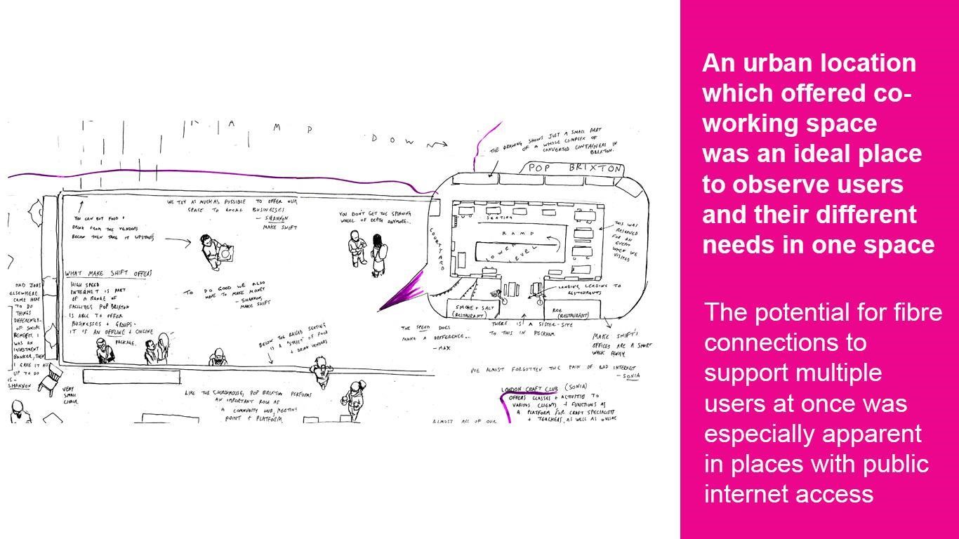
This drawing shows the layout of a co-working space where we spent time learning about users of the space who are using and benefiting from high-speed internet connections.
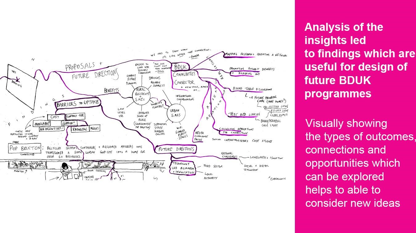
Outcomes of this research include anecdotal evidence for the ways gigabit connectivity is being used: the activities that are supported by the connection; insights into why the connection was taken up; barriers to uptake; and insights into impact on business and personal lifestyles and productivity. This drawing portrays some of the potential partnerships and interventions that could be developed based on the data findings.
In ethnographic studies, it is important to approach research contexts with an open mind. The goal is not to find what you are looking for but to learn as much as you can about your subjects. In other words, it’s explorative.
Developing new methods for data collection raises concerns about validity, especially when experimental methods are employed. Within time and budget constraints, it is a risk to try new methods and therefore useful, where possible, to pilot and test activities. But testing can only offer so much. Collecting qualitative data often means there is no guessing the types of people and insights that might be encountered. You can plan as much as you like, but you never know who you will meet and what type of day they are having. Being open, flexible and aware is key to delivery in these types of research activities.
While user research can be implemented to inform policy and program decision-making, equally important is understanding how the user insights are collected and how this information is delivered in ways that can meaningfully incite change
As well as being open to the types of insights that are collected, it is useful to consider that the data and the way it is shared can lead to unexpected outcomes and impacts. While user research can be implemented to inform policy and program decision-making, equally important is understanding how the user insights are collected and how this information is delivered in ways that can meaningfully incite change. For example, a 30-page report might be useful to one team whereas a bullet list, a visualisation or a presentation might be more impactful depending on the context of your audience and their agenda.
An alternative representation of data can help motivate new agendas by reframing connections and possibilities. In future, while delivering insights, the aim is to turn the stakeholders into the “users”, by observing how they interact with the data. These findings will be valuable for developing a broader understanding of how to research “How to use ethnographic studies with users in policy design”. — Marion Lean
For more information on this research, you can access the full report here.
(Main Picture Credit: Unsplash)
Make sure to share your own thoughts with the author by leaving a comment below

Log in or sign up to continue the conversation