
This post is written by Rebeca Pop, founder of Vizlogue and an expert in data visualisation and data storytelling.
The problem: Many public servants and policymakers create charts on a regular basis, but might not be aware of key data visualisation best practices.
Why it matters: Data is crucial to the success of the public service and Excel is a data visualisation tool commonly used.
The solution: In this blog post, public servants and policymakers will learn hands-on how to apply data visualisation best practices to improve their Excel charts.
Are you presenting data using Excel chart templates? If so, you might have noticed that some of these templates look cluttered and redundant. In this article, I’ll walk you through three key data visualisation best practices. Afterwards, I’ll show you a few simple steps that I took to apply these best practices and improve a bar chart created in Excel. Towards the end, I hope you’re up for a challenge. You’ll have the opportunity to practise using a data set about the Winter Olympics.
Key best practices
I could talk about data visualisation best practices for hours. Entire books have been written just on this topic. For the purpose of this article, I’ll cover three best practices that I believe are highly applicable to public servants and policymakers.
Best practice #1: Declutter & remove redundancies
Whenever you create a chart, pause and ask yourself: Is your chart redundant? Or, does it include unnecessary information? If either answer is yes, try to remove as much information as possible until you get to a point where there’s nothing else that you could remove without losing meaning or context.
Take a close look at the chart below from the Northern Ireland Assembly’s research website. The chart shows COVID-19 deaths (five-day moving averages) per million population for selected countries. You might notice that the chart appears cluttered and redundant, which makes it hard to read. First, the legend is placed above the lines and there’s a line next to each country label. This means that the audience has to constantly go back and forth between the trend lines and the legend to decipher the information. The more lines there are, the more exhausting this process is for the audience.
Next, notice the X-axis. The text is placed vertically, which makes it hard to read. Also, the X-axis is redundant. Does the designer really have to specify the months of March and April many, many times? Instead, the designer could have simply mentioned each month once.
Finally, the border around the chart could be classified as clutter as it doesn’t provide any information that would help us better understand the data. On the contrary, the border line is yet another piece of information that the audience has to read.

Source: www.assemblyresearchmatters.org
Best practice #2: Be creative
I won’t encourage you to be creative just for the sake of being creative. Assess your specific scenario to determine whether creativity can help elevate your data visualisation. For example, if you’re working on an annual financial report, you might want a clean, clear chart. Creativity might not be that important. On the other hand, Instagram might be the right medium to incorporate creativity and attract your audience’s attention.
Take a look at the chart below from McKinsey & Company about greenhouse-gas emitters. What do you notice? Does the cow stand out? Instead of displaying the category ‘cattle & dairy’ as a bar, the designer chose to think outside the box and placed a cow in the middle of the chart. By doing so, the message becomes clear and memorable – cattle and dairy are one of the top greenhouse-gas emitters, on par with other major countries.

Source: www.mckinsey.com
"Every time you are done creating a chart, pause and ask yourself what your audience could learn from the data."
Best practice #3: Be insightful
Have you ever taken a chart to your manager to then immediately be asked what the insight was? Many years ago, I had a manager who insisted that the insight should be immediately apparent in any chart. Fortunately, that taught me early in my career that there’s no point creating a chart if there’s no insight and those insights need to be clearly communicated.
I often see public servants who create beautiful data visualisations, but forget about the insight. Every time you are done creating a chart, pause and ask yourself what your audience could learn from the data. Once you’ve answered this question, ensure that the insight is clearly communicated in the form of a headline or an annotation. In the example above, the headline “If cows were a country, they would be among the top greenhouse-gas emitters” does a wonderful job highlighting the insight.
My hope is that you’ll be able to immediately apply these three best practices and improve the way you communicate with data. I encourage you to use them as guidelines, rather than strict rules. While best practices are applicable most of the time, there might be exceptions. Pause and ensure that these best practices make sense for your data and your audience.
Chart transformation
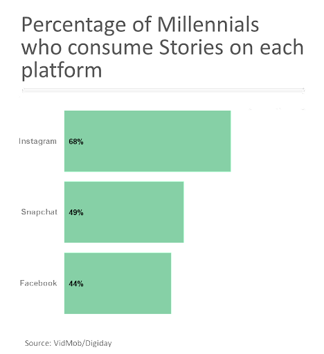
To bring these best practices to life, I took a chart from Digiday that looks at the percentage of millennials who consume stories on Instagram, Snapchat, and Facebook. Next, I will show you step-by-step the changes that I made to remove clutter and redundancies, add creativity, and include a more insightful headline.

Source: www.digiday.com
Step 1: Remove gridlines as they don’t add any relevant information in this case.

Step 2: Omit the X-axis as the data points are already labelled (redundancy).

Step 3: Make the Y-axis horizontal, as vertical text is hard to read.

Step 4: Remove the thick border between the Y-axis and the bars, as it is simply clutter.
Step 5: Use colour strategically to highlight a key data point or category (Instagram).

Step 6: Add an insight to communicate to the audience what they can learn from this chart.
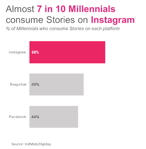
Step 7: Consider using icons.

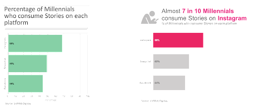
Before and after:
Your turn!
I mentioned at the beginning of this article that you’ll get the chance to practise. Using this handout and the Excel chart below about speed skating at the Winter Olympics, take the specified steps to apply data visualisation best practices and improve the original chart.

All requirements are available in the handout:

If you get stuck or if you’re simply curious about how I would transform this chart, I recorded a video that walks you step-by-step through how I redesigned this visualisation.
Skip past videoConclusions
I hope this article provided you with the knowledge to make more informed decisions next time you create a chart. But I also hope your journey doesn’t stop here. Once you finalise the exercise I provided above, I hope that you’ll continue to practise at work and maybe even in your free time.
You can connect with Rebeca on LinkedIn or Twitter, where she frequently publishes data visualisation content, or you can subscribe to the monthly Vizlogue newsletter.
👋 You can create a post like this one! Share your thoughts with a community of public servants. Learn more
(Image Credit: Unsplash)
Make sure to share your own thoughts with the author by leaving a comment below

Log in or sign up to continue the conversation