
This opinion article is an excerpt from the book “How Charts Lie: Getting Smarter about Visual Information” by Alberto Cairo. For more like this, see our digital government newsfeed.
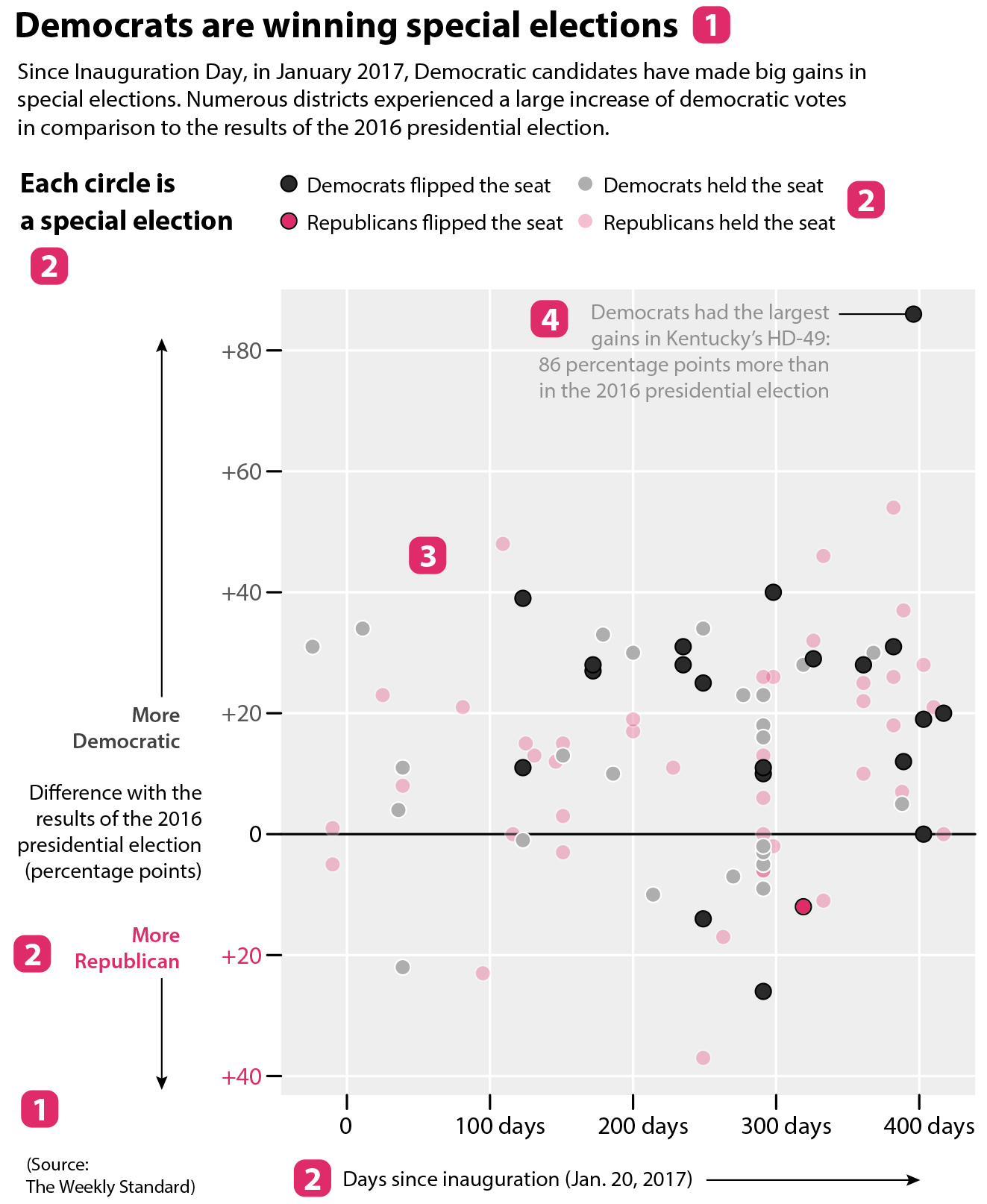
The same way that a long, deep, and complex sentence like that above can’t be understood in the blink of an eye, charts that display rich and worthwhile information will often demand some work from you. A good chart isn’t an illustration but a visual argument or part of an argument. How should you follow it? By taking the steps inside the red boxes I added to the following complex but illuminating chart by Washington Post data reporter David Byler.
Title, introduction (or caption), and source
If the chart includes a title and a description, read them first. If it mentions its source, take a look at it.
Measurements, units, scales, and legends
A chart must tell you what is being measured and how. Designers can do this textually or visually. Here, the vertical scale corresponds to the difference between the results of several special elections and the results of the 2016 U.S. presidential election. The horizontal scale is the number of days since Inauguration Day, January 20, 2017. The color legend tells us that the circles indicate who won each special election.
Methods of visual encoding
We’ve already spotted one: color. Grey indicates a Democratic victory; and red, a Republican victory. The color shade, darker or lighter, corresponds to whether either party flipped the seat.
The second method of encoding is position: position on the vertical axis is proportional to the difference in percentage points in comparison to the results of the 2016 presidential election. In other words, the higher above the zero baseline a circle is, the better Democrats did in comparison to 2016; the opposite is true if a circle is below the baseline.
To be even clearer: Imagine that in one of these districts Republicans got 60% of the vote in the 2016 presidential election and that, on this chart, this district’s circle sits on the +20 line above the baseline. This means that Republicans got just 40% of the vote in the current special election—that is, a +20 percentage point change in favor of Democrats (if there weren’t third-party candidates, of course).
Read annotations
Sometimes designers add short textual explanations to charts to emphasise the main takeaways or highlight the most relevant points. In this chart, you can see a note about a race in Kentucky’s House District 49, where the Democrats flipped the seat after getting a whopping 86 percentage point increase in support.
Take a bird’s-eye view to spot patterns, trends, and relationships
Once you have figured out the mechanics of a complex chart like this, it’s time to zoom out and think of patterns, trends, or relationships the chart may be revealing. When taking this bird’s-eye view, we stop focusing on individual symbols—circles, in this case—and instead try to see them as clusters. Here are a few facts I perceived:
Since January 20, 2017, Democrats flipped many more seats from Republicans than Republicans from Democrats. In fact, Republicans flipped just one seat.
In spite of that, both Democrats and Republicans held on to many seats.
There are many more dots above the zero baseline than below it. This means that Democrats made big gains in the first 300 days after Inauguration Day, in comparison to their results in the 2016 presidential election.
How long did it take me to see all that? Much longer than you may think. Nevertheless, this is not a sign of a poorly constructed chart.
Many of us learned in school that all charts must be amenable to being decoded at a quick glance, but this is often unrealistic. Some elementary graphs and maps are indeed quick to read, but many others, particularly those that contain rich and deep messages, may require time and effort, which will pay off if the chart is well designed. Many charts can’t be simple because the stories they tell aren’t simple. What we readers can ask designers, though, is that they don’t make charts more complicated than they should be for no good reason.
In any case, and to continue with the analogy between charts and text I began a few pages back: you can’t assume you’ll interpret a news story or an essay well if you read its title alone or if you browse it inattentively or hastily. To extract meaning from an essay, you must read it from beginning to end. Charts are the same. If you want to get the most from them, you need to take a deep dive.
The book “How Charts Lie: Getting Smarter about Visual Information” was published in 2019 by Norton Press.
(Picture credit: Pexels)
Make sure to share your own thoughts with the author by leaving a comment below

Log in or sign up to continue the conversation